



Blue Wallpaper
Explore blue wallpaper in shades ranging from pale sky and powder blue to denim, navy and deep inky tones. Choose from florals, checks, stripes, geometrics, textured plains and statement designs from leading designer wallpaper brands.
Blue can feel calm, crisp or dramatic depending on its undertone, pattern and the light in your room. Order samples where available to compare colour, scale and texture, and check the individual product specification for roll or panel size, repeat, match and hanging guidance before ordering.
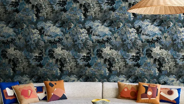

Get A Quote

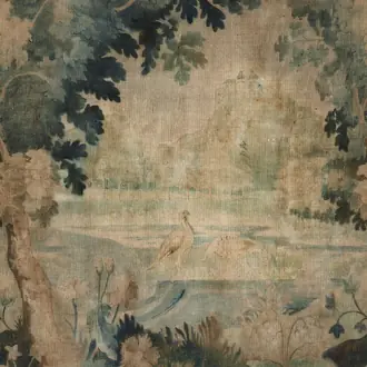
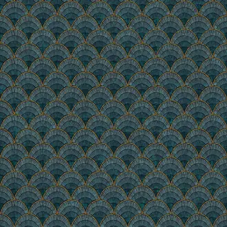
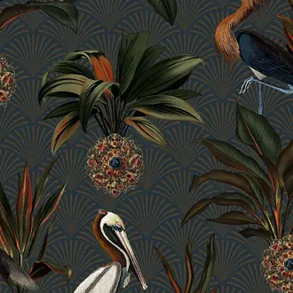
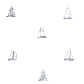
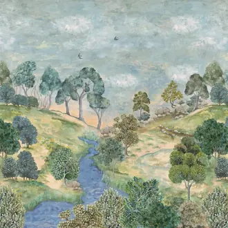
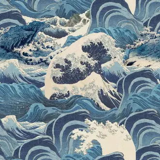
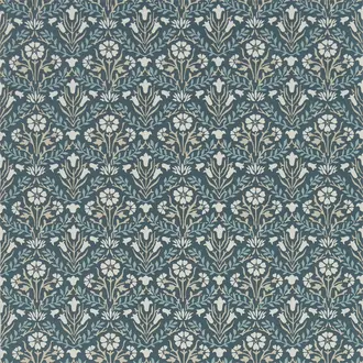
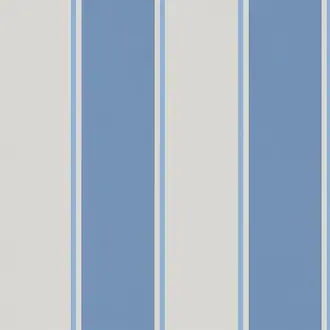
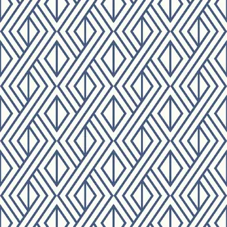
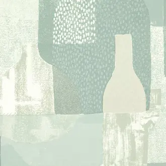
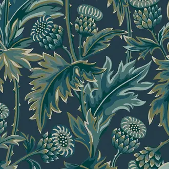
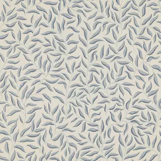
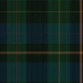
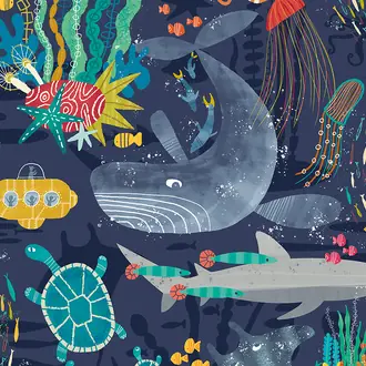

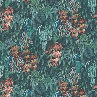
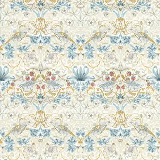
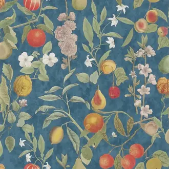
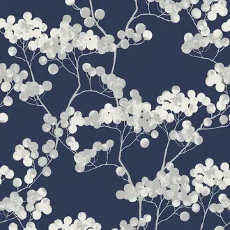
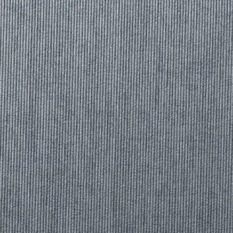
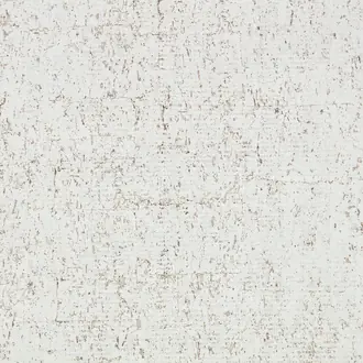
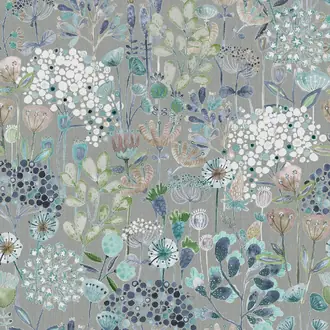
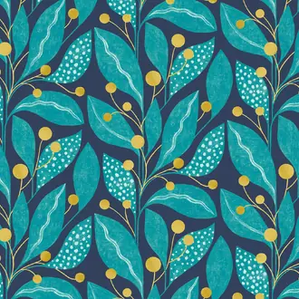
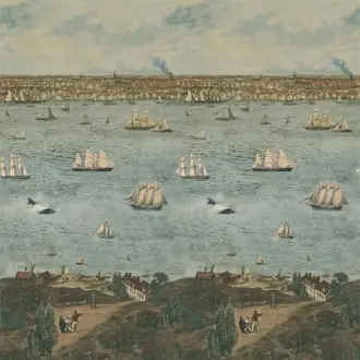
A colour family from powder to inky navy
Blue Wallpaper Beyond a Single Cool Colour
Blue wallpaper moves from powder and sky through denim, aqua and slate to deep navy and ink. The amount of white, grey, green or black within the shade determines whether blue feels light and relaxed, muted and architectural, or rich and dramatic.
Pattern and surface alter the effect again. Checks and stripes feel tailored, geometrics add structure, and woven or silk-like finishes create tonal movement while allowing the colour itself to remain the main feature.
Powder and sky blue
Pale blues create an airy background and sit naturally with white, cream, light timber and relaxed pattern.
Denim, teal and slate
Mid-tone blues provide more definition, with green or grey undertones changing the warmth and formality of the room.
Navy and inky blue
Deep blue creates intimacy and contrast, particularly beside warm timber, pale upholstery and metallic detail.

Light, airy and softly structured
Pale, Powder and Light Blue Wallpaper
Pale blue introduces colour without making a room feel heavy. Powder, sky and softly greyed blues can behave almost like cool neutrals, particularly when the design includes plenty of white or a fine-scale repeat.
Checks, small motifs and quiet stripes give light blue more structure while retaining brightness. They work well in bedrooms, living rooms and smaller spaces where pattern is wanted without strong contrast.
Warm white, cream and timber prevent pale blue from feeling cold. A small amount of darker navy can give the scheme useful definition.

Pattern, scale and architectural order
Blue Geometric, Striped and Checked Wallpaper
Blue is particularly effective in structured pattern. Fine stripes and checks feel crisp and tailored, while larger geometric repeats give the colour a more contemporary architectural quality.
Scale matters as much as shade. A small repeat can read almost as texture from across the room, whereas broad stripes and larger geometrics become an obvious part of the interior scheme.
Use the repeat and room image together when assessing a design. The sample shows colour and finish, but a wider view reveals how strongly the geometry will influence the complete wall.

Colour expressed through surface
Plain, Textured and Tonal Blue Wallpaper
A blue wall does not need a strong printed pattern to have character. Tonal printing, woven effects and tactile wallcoverings create depth through surface variation, allowing colour and material to work together.
Textured blue changes as daylight moves across the wall, especially where the surface contains natural fibre, silk-like threads, embossing or subtle reflectivity. Some areas appear lighter while others become deeper and more saturated.
Natural and specialist surfaces may show visible joins, panel variation or irregular fibre. These characteristics are often part of the wallcovering's intended appearance.
Building a balanced blue scheme
Choose Undertone, Depth and Contrast Together
Blue is unusually versatile because its effect changes so much with shade, texture and the colours around it. Connect the undertone with the room's permanent materials before deciding how pale or deep the wallpaper should be.
Blue and white
Crisp white gives blue clarity and works naturally with checks, stripes, small motifs and traditional decorative schemes.
Blue and warm neutrals
Timber, tan leather, cream upholstery and natural fibres soften cooler blues and make navy or slate feel more balanced.
Blue and green
Aqua and sage create a pale nature-led palette, while teal, forest green and navy produce a deeper, more enveloping combination.

Deep colour, samples and specification
Check Navy and Blue in Your Own Light
Dark blue can change significantly between natural and artificial light. Some shades lean grey, some appear almost black at night, and others reveal greener or brighter undertones.
View samples vertically beside paint, flooring, curtains and upholstery in morning, afternoon and artificial light. Check the specification for roll or panel dimensions, repeat, match, backing and hanging instructions before ordering.
Continue browsing
Related Designer Wallpaper
Frequently asked questions
Blue Wallpaper FAQs
What colours work well with blue wallpaper?
White creates crisp contrast, cream and warm neutrals soften cooler blues, natural timber adds warmth, and green works particularly well in botanical or nature-led schemes.
Can blue wallpaper work in a living room?
Yes. Pale and tonal blues create a calm backdrop, while navy, textured and patterned designs give living rooms more depth. Natural light and surrounding furniture will influence the final effect.
Is navy wallpaper suitable for a small room?
It can be. Dark wallpaper creates a more enveloping effect, which can be attractive in compact rooms. Consider the light level, ceiling and woodwork colours, and whether you want contrast or a cocooning scheme.
What is the difference between pale blue and grey-blue wallpaper?
Pale blue is primarily defined by lightness, while grey-blue contains a stronger muted grey undertone. Manufacturers use colour names differently, so samples are more reliable when an exact shade matters.
Can blue wallpaper be used throughout a room?
Yes. Pale textures, small repeats and tonal patterns can work across several walls. Navy, large geometrics and strong stripes create a more defined atmosphere and may be used throughout or as a focal treatment.
Why should I order a blue wallpaper sample?
Blue can shift from warmer to cooler and from brighter to greyer depending on daylight and artificial light. A sample also reveals the true texture, reflectivity and pattern scale.
Do natural blue wallcoverings vary between lengths?
Natural fibres and handcrafted surfaces may show tonal movement, visible joins and panel variation. These effects are generally part of the material's intended character rather than faults.
Do specialist blue wallcoverings require professional installation?
Many natural, textile, metallic and panelled wallcoverings benefit from an experienced installer. Follow the product-specific preparation, adhesive, roll-sequence and hanging instructions.