


Cream Wallpaper
Explore cream wallpaper in shades ranging from soft ivory and warm off-white to richer biscuit and deeper cream tones. Choose from understated textured surfaces, elegant small-scale patterns and more decorative designer wallcoverings for living rooms, bedrooms, hallways and other interior spaces.
Cream is especially versatile because its undertone can shift with natural and artificial light. Some shades read warm and golden, while others sit closer to stone, ivory or soft neutral. Order samples where available to compare the colour and surface in your own room, and check the individual product specification for roll or panel size, repeat, match and hanging guidance before ordering.

Get A Quote








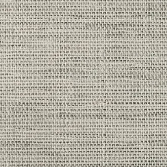
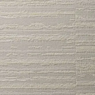

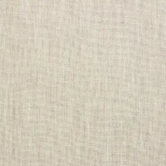

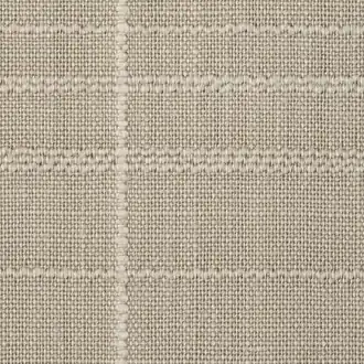
A warm neutral shaped by undertone and texture
Cream Wallpaper Beyond a Plain Neutral
Cream wallpaper offers a warmer alternative to pure white while remaining light, adaptable and easy to combine with other colours. Its character ranges from pale ivory and chalky off-white to richer vanilla, stone and biscuit tones.
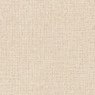
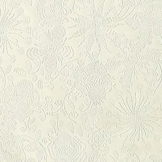
Surface changes the effect again. Woven fibres, raffia, embossing and gentle sheen create highlights and shadows, while tonal pattern gives cream walls definition without introducing heavy contrast.
Ivory and pale cream
Light warm neutrals soften a room and connect naturally with limestone, linen, pale timber and warm white paint.
Vanilla, stone and biscuit
Deeper cream tones add warmth and sit comfortably beside oak, walnut, leather and muted earthy colours.
Texture and tonal pattern
Woven and embossed finishes prevent a pale scheme from feeling flat while keeping the overall effect restrained.

Natural texture and material warmth
Luxury Cream and Textured Wallpaper
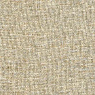
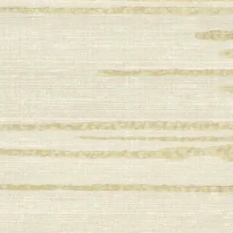
Texture is particularly effective in cream because it allows a quiet colour to develop depth. Raffia-inspired, woven and grasscloth-style wallcoverings create small variations in shadow and surface as daylight moves across the room.
Natural fibres may show tonal movement, panel variation and visible joins. These characteristics are normally part of the intended appearance rather than faults and should be assessed with a physical sample.
Pair tactile cream with timber, stone, linen, wool or leather. The combination creates a layered neutral scheme without relying on strong pattern or colour.

Pattern without heavy contrast
Cream Patterned and Designer Wallpaper
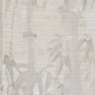
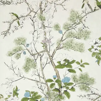
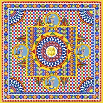
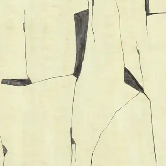
Cream does not have to mean plain. Small motifs, soft geometrics and delicate decorative repeats can add pattern while preserving the calm character of a pale neutral scheme.
Close-toned designs often become more noticeable as you move through the room rather than dominating at first glance. This makes them useful where furniture, artwork or textiles already provide stronger colour.
Match the pattern scale to the available wall area. Larger motifs need clear space, while smaller repeats adapt more easily around doors, windows and fitted joinery.

Quiet detail and refined finishes
Elegant Cream Wallpaper for Living Spaces
Cream wallpaper works particularly well in living rooms, bedrooms and hallways where warmth is wanted without committing to a stronger colour. Subtle movement or sheen makes the walls feel more finished while remaining easy to combine with changing furnishings.
In brighter rooms, cooler cream tones can appear almost off-white. Warmer cream becomes richer in low or evening light and may reveal yellow, beige or soft pink undertones.
Black creates crisp definition, muted blue and green add cooler contrast, and rust or brown reinforces the wallpaper's warmer character.
Building a balanced pale-neutral scheme
Choose Undertone, Texture and Lighting Together
The most successful cream connects with the permanent materials already in the room. Its undertone should work with flooring, timber and paint, while its surface and depth should support the atmosphere you want to create.
Read the undertone
Yellow and vanilla creams feel warmer; stone and greyed cream are quieter; ivory sits closer to warm white. Compare samples directly with adjacent finishes.
Judge it in changing light
North-facing daylight can cool a cream, while warm lamps deepen yellow and beige undertones. Check the intended wall at different times of day.
Use texture deliberately
Flat paper looks clean and precise. Woven, embossed and reflective surfaces create movement and make a simple neutral scheme materially richer.

Samples and selection
Check the Cream in Your Own Light
Pale neutral colours are especially sensitive to surrounding light. A cream that appears warm in one room may look cooler beside north-facing daylight, while artificial lighting can reveal yellow, beige, grey or pink undertones.
View samples vertically beside paint, flooring, stone, timber and fabrics in morning, afternoon and evening light. Also check the product specification for width, roll or panel format, pattern repeat, match, backing and hanging instructions.
Continue browsing
Related Designer Wallpaper
Frequently asked questions
Cream Wallpaper FAQs
Is cream wallpaper warmer than white wallpaper?
Generally yes. Cream usually contains warmer yellow, beige or stone undertones, while white may be cooler or more neutral. The effect changes with lighting and neighbouring colours, so compare physical samples.
What colours work well with cream wallpaper?
Cream works with natural timber, warm brown, muted green, soft blue, terracotta and black accents. Choose combinations that connect with the particular wallpaper's yellow, beige, grey or pink undertone.
Is cream wallpaper suitable for a living room?
Yes. It provides a warm neutral background for furniture and artwork, while textured or subtly patterned designs add depth without making the room feel heavily decorated.
What is the difference between cream, ivory and beige wallpaper?
Cream is usually a warm pale neutral, ivory sits closer to off-white, and beige generally contains more brown or stone. Manufacturers use these names differently, so the physical sample is more reliable than the colour name alone.
Can cream wallpaper be used throughout a room?
Yes. Textures, plains and small tonal repeats can work comfortably across several walls. Stronger sheen or larger motifs may be used throughout or reserved for a focal wall depending on the intended atmosphere.
Why should I order a cream wallpaper sample?
Cream shades are strongly affected by daylight, artificial light and neighbouring materials. A sample reveals the true undertone, surface, reflectivity and scale in the room where it will be used.
Do natural cream wallcoverings vary between lengths?
Natural fibres and handcrafted surfaces may show tonal movement, visible joins and panel variation. These effects are usually part of the material's character rather than manufacturing faults.
Do specialist cream wallcoverings require professional installation?
Many natural, textured, metallic and panelled wallcoverings benefit from an experienced installer. Follow the manufacturer's wall preparation, adhesive, roll-sequence and hanging instructions.