


Turquoise Wallpaper
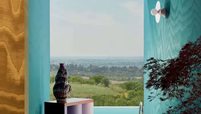
Explore designer turquoise wallpaper across the point where blue meets green, from pale mineral aqua and clear lagoon tones to deep peacock and petrol shades. The collection brings together quiet textures, architectural geometrics, botanical patterns and large-scale murals for both complete rooms and focal walls.
Surface is especially important with turquoise. Woven, patinated and metallic finishes soften or deepen the colour, while printed designs keep it crisp and graphic. Order samples to compare the undertone, pattern scale and finish in your own light before choosing.

Get A Quote





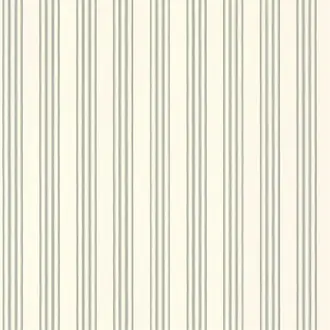
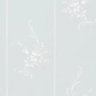

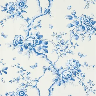


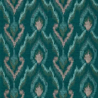



Blue-green colour, considered through light and material
Turquoise Wallpaper from Mineral Aqua to Deep Peacock
Turquoise is not one fixed shade. Some designs lean towards cool blue, others carry more green, and the deepest versions approach teal or petrol. That movement makes turquoise unusually adaptable, but it also makes undertone important.
Texture changes the colour again. Matte papers feel clear and graphic; woven and weathered surfaces introduce tonal variation; metallic finishes catch light and create greater depth.
Pale aqua and mineral tones
Chalky, sea-glass and mineral turquoise can bring colour to a room while retaining a light, quiet character.
Clear turquoise and lagoon
Balanced blue-green shades feel fresher and more defined, particularly in geometric, botanical and abstract pattern.
Peacock, petrol and deep teal
Darker expressions create a more enveloping mood and pair naturally with timber, stone, bronze and warm neutral fabrics.

Light, architectural colour
Pale Turquoise and Mineral Aqua Wallpaper
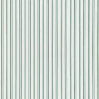
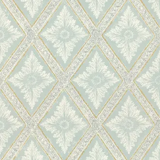
Pale turquoise sits between misty blue, soft green and mineral grey. In a fine texture or small geometric repeat it can cover several walls without becoming visually dominant, while still giving a room more character than a neutral.
Warm white, limestone, pale oak and muted clay prevent light aqua from feeling cold. Black or dark bronze details add definition where a scheme needs stronger contrast.
Because these shades respond noticeably to daylight, view a sample beside the room's permanent finishes in both morning and evening light.

Colour carried by pattern
Patterned Turquoise Wallpaper
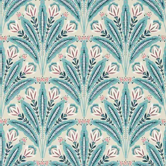
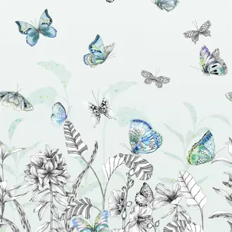
Botanical, floral and geometric designs allow turquoise to work as part of a wider palette. Cream, charcoal, olive, ochre and natural brown can temper its clarity, making a colourful design easier to connect with furniture and fabrics.
Repeat one or two colours from the wallpaper elsewhere in the room rather than matching every shade. This creates a coherent scheme while allowing the pattern to remain the focal point.
Large motifs need enough visible wall to read clearly; smaller repeats are more adaptable where doors, windows or shelving divide the surface.

Surface softens saturation
Natural and Textured Turquoise Wallcoverings
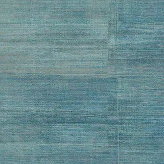
Grasscloth, paperweave and textile effects break turquoise into highlights and shadows. The result feels less flat than a printed plain and can make a saturated colour more comfortable across a complete room.
Natural fibres may show tonal movement, visible joins and variation between lengths. These characteristics form part of the material's appeal, but they should be understood before ordering and installation.
Pair textured turquoise with oak, walnut, plaster, linen and stone to keep the scheme grounded rather than overtly coastal.

Colour at an immersive scale
Turquoise Murals and Panoramic Wallpaper
A mural can use turquoise as atmosphere rather than a single block of colour. Abstract movement, landscape and large-scale pattern create areas of light and dark that change across the wall.
Plan the composition around the architecture. Check where key features will fall beside windows, doors, fireplaces and major furniture, and confirm which parts of the image may be concealed.
In an open room, draw a secondary colour from the mural into nearby upholstery or joinery so the panorama belongs to the wider space.

Patina, reflection and depth
Metallic and Patinated Turquoise Wallpaper
Silver, bronze, mica and aged-metal effects shift turquoise as light moves across the surface. Pale designs can appear almost mineral, while darker finishes take on the depth of oxidised copper or peacock tones.
Reflection is most effective when it supports the material rather than overwhelming the room. View the sample vertically and from several angles, especially where spotlights or direct sun will reach it.
Stone, dark timber and simple upholstery give these complex surfaces space to register without competing for attention.

The darker end of the palette
Deep Turquoise, Peacock and Petrol Wallpaper
Deep turquoise carries more visual weight than pale aqua and can create an enveloping room. Peacock shades often retain a vivid green-blue clarity; petrol tones are smokier and closer to a dark teal.
Use warm timber, russet, burgundy, antique brass or soft plaster tones to offset the coolness. Pale ceilings and well-placed lighting can keep a dark scheme defined without removing its intimacy.
A sculptural or embossed surface intensifies shadow, so compare both the face colour and the relief before committing to several walls.
Building a considered scheme
Choose Undertone, Scale and Surface Together
Treat turquoise as a family of blue-green colours. The right choice depends on which side of the spectrum the design occupies, how much wall it covers and how its finish reacts to light.
Read the undertone
Blue-leaning turquoise feels cooler and clearer; green-leaning shades are earthier. Compare the sample directly with flooring, timber and paint.
Match scale to the wall
Large murals and motifs need uninterrupted space. Small repeats and textures adapt more comfortably to openings, alcoves and joinery.
Balance cool and warm
Stone, warm white, oak, walnut, ochre and rust prevent turquoise schemes from feeling cold while preserving the colour's freshness.

Samples and selection
See the True Blue-Green Balance at Home
Turquoise can appear bluer, greener or greyer as surrounding light changes. Screens also flatten woven texture, embossing and metallic reflection.
View samples vertically beside paint, flooring, fabrics and furniture at several times of day. For murals and large motifs, use the sample to assess colour and material, then refer to the full product image and technical details for composition and scale.
Continue browsing
Related Designer Wallpaper
Frequently asked questions
Turquoise Wallpaper FAQs
What colours work well with turquoise wallpaper?
Warm white, stone, sand, oak and walnut soften turquoise. Ochre, rust, coral and burgundy add warm contrast, while navy, green and charcoal create a deeper tonal scheme. Begin with the exact secondary colours in a patterned design.
Is turquoise wallpaper blue or green?
Turquoise sits between blue and green, but individual designs vary. Pale aqua may lean blue, clear turquoise can feel evenly balanced, and peacock or petrol shades often contain more green or grey. A physical sample is the best way to judge the undertone.
Can turquoise wallpaper be used throughout a room?
Yes. Fine textures, small repeats and mineral turquoise tones can work across all four walls. Large murals or highly saturated patterns may be better used where they have enough space to become a deliberate focal point.
Does turquoise wallpaper have to look coastal?
No. The material and surrounding palette determine the result. Pair turquoise with plaster, dark timber, bronze, graphic pattern or sculptural texture for a more architectural, contemporary or luxurious character.
Which rooms suit turquoise wallpaper?
Turquoise can work in living rooms, bedrooms, dining rooms, halls, home offices and bathrooms where the chosen product is suitable. Pale tones feel open; deeper peacock and petrol shades create a more intimate atmosphere.
Why should I order a turquoise wallpaper sample?
Room light can shift turquoise noticeably between blue, green and grey. A sample also reveals texture, reflectivity and print detail that cannot be assessed accurately from a screen.
Do natural and metallic turquoise wallcoverings vary?
Natural fibres and handcrafted surfaces may show tonal movement and visible joins, while metallic finishes change as light and viewing angle change. These effects are usually part of the material's intended character.
Do specialist turquoise wallcoverings need professional installation?
Many natural, textured, metallic and panelled wallcoverings benefit from an experienced installer. Follow the manufacturer's instructions, check the panel or roll sequence, and prepare the wall for the specified substrate.