



Check Wallpaper
Check wallpaper offers a timeless and versatile design option for interior walls. Ideal for adding a masculine touch, check patterns range from traditional tartan to modern interpretations, fitting well in both classic and contemporary settings. Whether used in a study, living room, or hallway, check wallpaper adds depth and texture. Popular choices like grey or navy check wallpaper can enhance a room's character, creating a sophisticated atmosphere with a touch of heritage. Explore various designs to bring a piece of tradition into your home.

Get A Quote







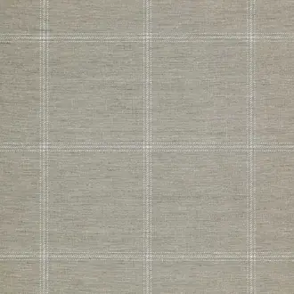


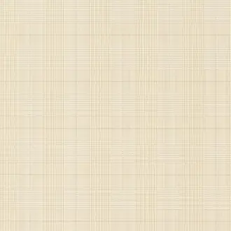


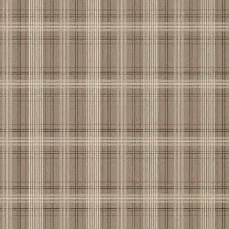




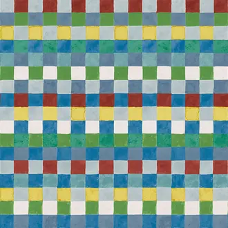


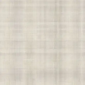


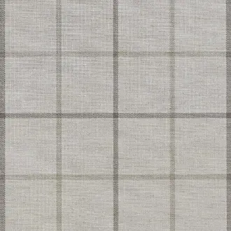


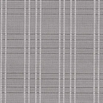













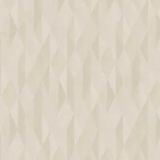


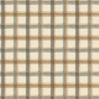


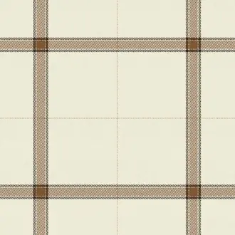



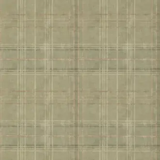


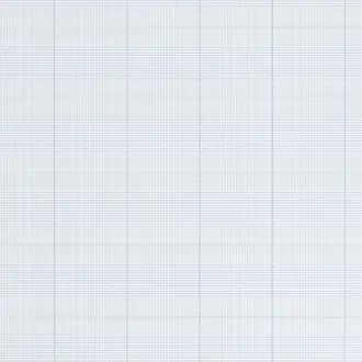
Tailored pattern and structure
What Is Check Wallpaper?
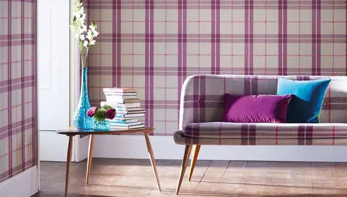
Check wallpaper uses intersecting horizontal and vertical lines to create patterns ranging from a fine windowpane grid to gingham, buffalo check, plaid and traditional tartan. The geometry brings order to a room, while the colour, line weight and surface determine whether the design feels quiet, tailored or boldly decorative.
These patterns can suit complete rooms as well as feature walls. Small tonal checks often behave like texture, while broad bands, layered colour and oversized squares make the repeat a stronger part of the interior.
Classic checks
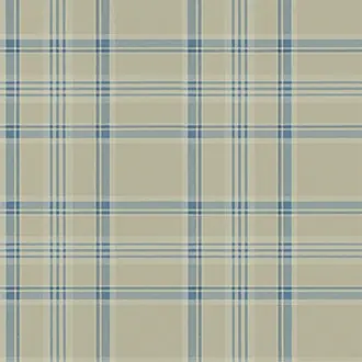
Balanced squares and fine windowpane lines introduce structure without overwhelming furniture, artwork or architectural detail.
Plaid and tartan
Layered bands and richer colour combinations bring warmth, depth and a tailored heritage character to the wall.
Modern checks
Enlarged grids, softened lines and woven effects reinterpret the familiar motif for relaxed contemporary interiors.

Layered colour and heritage
Plaid and Tartan Wallpaper
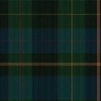
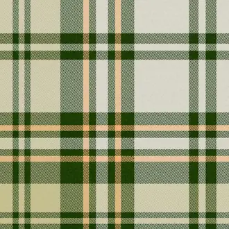
Plaid wallpaper combines horizontal and vertical bands of different widths and colours. Tartan usually has a more recognisable layered arrangement associated with woven cloth, although the terms are often used interchangeably when describing wallpaper.
Deep green, navy, red and charcoal colourways create a strong heritage mood for studies, libraries, hallways and comfortable living rooms. Softer blue, stone and oatmeal versions retain the tailored pattern while feeling lighter and more relaxed.
Natural timber, leather, linen and wool complement the textile character. If other patterned fabrics are being used, vary their scale so that one design remains dominant.

Clear squares and contrast
Gingham and Buffalo Check Wallpaper
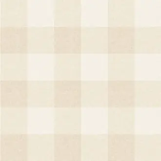
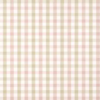
Gingham is formed from evenly spaced lines and a restrained palette, producing a familiar sequence of light, medium and darker squares. Smaller gingham designs can provide an easy background for bedrooms, kitchens and informal sitting rooms.
Buffalo check enlarges the same basic structure into broader blocks. A black and white design feels crisp and graphic, while green, red, blue or neutral interpretations can appear warmer and less formal.
The stronger the contrast, the more visually prominent the grid becomes. A bold buffalo check can anchor a feature wall, entrance hall, cloakroom or study when neighbouring surfaces and fabrics are kept comparatively simple.

A bolder contemporary scale
Modern Check Wallpaper
Modern check wallpaper may enlarge the repeat, simplify the palette or replace perfectly straight lines with softer hand-drawn marks. The result retains the order of a grid while feeling less formal than a traditional tartan.
Oversized navy and blue checks make a confident architectural statement and can be especially effective where there is enough uninterrupted wall area for the repeat to remain clear. Tonal designs offer a quieter route and can work comfortably around a complete room.
Contemporary furniture and plain textiles help a large check feel intentional rather than busy. Repeating one colour from the wallpaper in cushions, upholstery or paint can connect the scheme without duplicating the pattern.

Quiet colour and woven character
Blue, Grey and Neutral Check Wallpaper
Blue check wallpaper can feel coastal, tailored or playful according to the depth of colour and scale of the repeat. Powder blue and faded denim create an airy background; navy gives the same geometry a smarter and more grounded presence.
Grey checks sit comfortably with warm timber, tan leather and chalky paint colours. Cream, beige and natural checks offer the most understated effect, allowing the intersecting lines to introduce depth without adding a dominant new colour.
Some tonal checks resemble woven fabric from across the room. Subtle printing, surface relief and linen effects soften the geometry and make these designs useful where texture matters more than contrast.
Choosing and hanging the design
Consider Check Scale, Contrast and Alignment
The regular lines make differences in scale and alignment particularly visible. Review the full repeat, room-set photography and technical information before deciding how the wallpaper will sit around doors, windows and furniture.
Small or oversized
Fine checks create a quieter rhythm and can read almost as texture. Large checks become a clear decorative feature and need enough visible wall area to be appreciated.
Tonal or contrasting
Closely related colours soften the grid. Strong differences between the ground and crossing lines make the pattern more graphic and visually assertive.
Accurate alignment
Use a true vertical starting line and follow the stated match and repeat. Professional installation may be worthwhile where walls are uneven or the check is especially precise.

Samples and selection
Check Colour, Scale and Texture at Home
A sample helps you assess the true line colour, contrast, finish and relationship between the pattern and your furniture, flooring and fabrics. Place it on more than one wall and view it in morning, afternoon and artificial light.
A sample may show only part of a large plaid or oversized check. Compare it with the complete repeat and room-set images, and check the stated repeat dimensions before ordering. Availability, size and charges vary by supplier.
Continue browsing
Related Designer Wallpaper
Frequently asked questions
Check Wallpaper FAQs
What is the difference between check, plaid and tartan wallpaper?
Check is the broad term for patterns formed from intersecting horizontal and vertical lines. Plaid commonly combines several bands or colours, while tartan describes a more specific layered arrangement associated with woven cloth. Product naming varies, so closely related designs are brought together here for easier comparison.
What are gingham and buffalo check wallpaper?
Gingham usually uses evenly spaced lines and a restrained colour palette to create small or medium squares. Buffalo check applies the idea at a larger, bolder scale, often with stronger contrast between the squares.
Does check wallpaper make a room look smaller?
Not necessarily. A light tonal check or fine windowpane pattern can introduce structure without reducing the sense of space. Large, dark or high-contrast checks carry more visual weight, so sampling helps establish whether the scale is comfortable in the room.
Can check wallpaper be used on every wall?
Yes. Fine checks, soft ginghams and low-contrast woven effects often work particularly well throughout a complete room. Oversized or strongly contrasting checks can also be immersive, although some customers prefer to use them on a principal feature wall.
Which rooms suit plaid or tartan wallpaper?
Plaid and tartan can work in studies, libraries, living rooms, bedrooms, hallways, cloakrooms and boot rooms. Muted colourways feel relaxed, while traditional green, navy, red and charcoal palettes produce a stronger heritage character.
Is check wallpaper difficult to hang?
The straight lines make accurate matching and vertical alignment important. Check the pattern repeat and match type, prepare the walls carefully and establish a plumb starting line. Consider professional installation for uneven walls, complex rooms or particularly precise designs.