



Retro Wallpaper
Explore retro wallpaper through the shapes, colour and visual energy associated with mid-century interiors, the optimistic 1960s and the more expressive patterns of the 1970s. The collection includes bold geometrics, atomic motifs, rounded forms and archival-inspired designs alongside contemporary wallcoverings that reinterpret the period.
Retro does not have to mean novelty decoration. A restrained geometric can bring rhythm to a complete room, while ochre, rust, avocado, teal and stronger Pop-inspired colourways create a more distinctive feature. Order samples to assess the scale and contrast in your own light.

Get A Quote
















































Mid-century form, Sixties colour and Seventies rhythm
What Makes Wallpaper Retro?
Retro wallpaper draws on recognisable twentieth-century design rather than simply looking old. Its identity comes from graphic repetition, optimistic colour, simplified shapes and the changing visual language of post-war interiors.
Some designs reproduce or revive an earlier pattern; others use contemporary materials to reinterpret the period. Both belong here when their shape, palette and rhythm create a clear mid-century, 1960s or 1970s character.
Mid-century geometry
Ordered grids, abstract blocks and interlocking forms bring structure without relying on traditional ornament.
Sixties and Pop influence
High contrast, repeated circles and playful colour give walls the optimism and visual energy associated with the decade.
Seventies curves
Rounded lines, arches and warmer shades such as ochre, rust, olive and brown create a softer, more enveloping rhythm.

Graphic repetition and atomic form
Mid-Century and Atomic Wallpaper
Mid-century wallpaper often reduces decoration to one strong repeating idea: a starburst, lozenge, grid, circle or interlocking line. These ordered motifs sit naturally with the clean silhouettes and functional forms of post-war furniture.
Small-scale atomic patterns can add energy without dominating the room, particularly when the design uses only two colours. Larger or higher-contrast geometrics become a stronger focal point and benefit from clearer wall space around furniture and artwork.
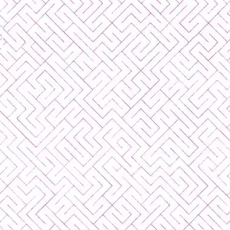
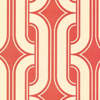
The photographed Little Greene Lavaliers Atomic design is one example of this approach: its compact red motif creates a lively period rhythm while remaining suitable for more than a single feature wall.

Curves, arches and measured repetition
1960s and 1970s Inspired Wallpaper
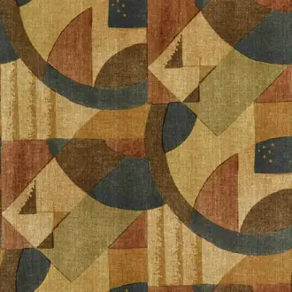
As the century progressed, geometric wallpaper became rounder and more expressive. Repeated arches, softened squares, waves and continuous lines introduced movement, while ochre, rust, olive and brown brought warmth to even the boldest patterns.
These larger designs work best where enough of the wall remains visible to understand the full repeat. In a narrow or highly interrupted space, choose a smaller motif so doors, windows and furniture do not conceal the rhythm that gives it character.
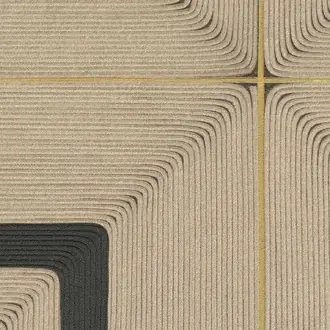
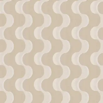
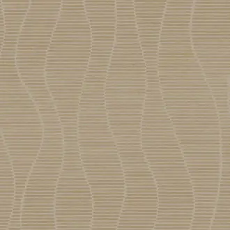
The illustrated Élitis Courbes wallcovering offers a contemporary interpretation, combining a broad curved repeat with a controlled neutral palette that feels retro without recreating a complete 1970s interior.

Pattern with energy
Colourful Retro and Pop-Inspired Wallpaper
Colour is one of the quickest ways to establish a retro mood. Mustard, burnt orange, olive, teal and deep brown recall familiar period palettes, while pink, red and blue move the scheme towards a brighter 1960s Pop influence.
For a balanced room, repeat only one or two wallpaper colours through upholstery, paint or smaller accessories. Plain flooring and simply shaped furniture give a multicoloured pattern room to breathe and prevent the scheme from feeling over-themed.
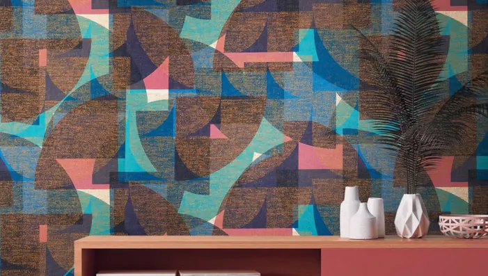
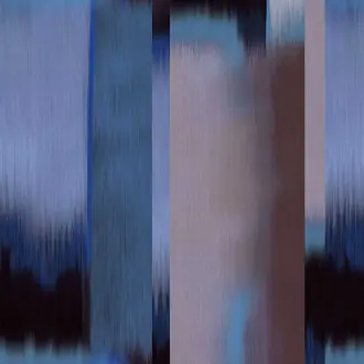
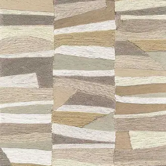
The pictured Élitis Beat design demonstrates the principle: repeated blocks generate movement and playfulness, while the disciplined structure and considered palette retain a sophisticated finish.

A more tailored interpretation
Modern Retro Wallpaper
A retro influence does not require a complete period interior. Modern retro wallpaper borrows a recognisable grid, curve, repeated motif or vintage-informed palette, then interprets it through contemporary scale, texture and colour.
This separates Retro from Contemporary Wallpaper: retro retains a visible connection to twentieth-century design, while contemporary describes current decoration without requiring that historical reference. Vintage Wallpaper is broader again and may include aged, archival or romantic patterns from many periods.
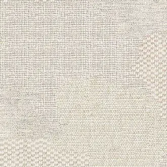
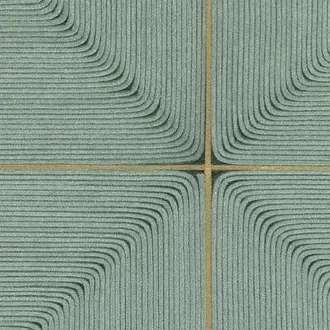
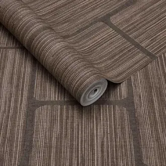
The pictured Élitis Carrés Jalonnés design is a useful modern example. Its repeated squares recall mid-century graphics, but the architectural scale works comfortably beside restrained furniture and contemporary objects.
Building a balanced room
Choose Pattern, Scale and Colour Together
Retro wallpaper is often visually confident, but it can be used across a whole room as well as on a feature wall. The decision depends on the size of the repeat, the contrast within it and how much uninterrupted wall remains visible.
Check the repeat
View the complete pattern rather than one isolated motif. A design that looks small on screen may create a much broader rhythm once several widths are installed.
Work with the architecture
Use an ordered small-scale repeat around doors and windows. Give larger geometrics a clearer wall where their complete structure can remain visible.
Control the palette
Draw two or three colours from the wallpaper into the room. Neutral flooring and simple furniture can give a brighter pattern enough visual space.

Samples and selection
See the Pattern at the Correct Scale
A sample lets you assess the printed colour, contrast and surface beside your flooring, paint, furniture and fabrics. Move it around the room and view it in both daylight and evening light.
A small cutting may not contain the complete repeat. Use the sample to judge colour and finish, then consult the room image and technical pattern repeat before deciding how the design will work across the wall.
Continue browsing
Related Wallpaper Styles
Frequently asked questions
Retro Wallpaper FAQs
What is retro wallpaper?
Retro wallpaper uses patterns, colours or graphic ideas associated with twentieth-century interiors, particularly the mid-century period and the 1960s and 1970s. It includes geometrics, atomic motifs, rounded forms, Pop-inspired colour and modern reinterpretations of these styles.
What is the difference between retro and vintage wallpaper?
Retro usually describes a recognisable period-inspired style, especially post-war and late twentieth-century design. Vintage is broader and may describe faded, aged, romantic or archival-looking wallpaper from several historical periods.
Is Art Deco wallpaper considered retro?
Art Deco can be described broadly as a historical revival, but it has a sufficiently distinct 1920s and 1930s identity to warrant its own collection. Retro Wallpaper here concentrates more strongly on mid-century, 1960s and 1970s design.
Which colours are associated with retro wallpaper?
Ochre, mustard, rust, orange, avocado, olive, teal and brown are closely associated with retro interiors. Brighter red, pink, blue and multicoloured combinations can create a more graphic or Pop-inspired result.
Can retro wallpaper work in a modern home?
Yes. Pairing one period-informed wallpaper with clean contemporary furniture keeps the reference intentional. A restrained geometric or limited palette can introduce retro character without making the complete room feel like a reproduction.
Should retro wallpaper cover every wall?
It can. Smaller repeats and quieter colourways often work well across a complete room. A very large or high-contrast geometric may be easier to balance on a clearer feature wall, particularly in a compact space.
How do I choose the right scale?
Consider both the pattern repeat and the amount of visible wall. Fine motifs read almost like texture from a distance, while large curves and blocks become part of the room's architecture. Check the technical repeat and room image alongside your sample.
Should I order a sample?
Yes. Screen images cannot reliably communicate scale, colour or finish. View the sample vertically in your own light and compare it with the room's permanent materials before ordering full rolls or lengths.