


Purple Wallpaper
Explore designer purple wallpaper across a broad palette, from pale lilac, lavender and smoky mauve to plum, aubergine and vivid violet. The collection brings together natural textures, architectural geometrics, botanical patterns and panoramic designs for both complete rooms and more expressive focal walls.
Purple changes considerably with its undertone and surface. Blue-based violet feels cooler and clearer, red-based plum appears warmer and richer, while woven, patinated and metallic finishes soften the colour through texture and light. Order samples to compare the true shade, scale and finish at home.

Get A Quote



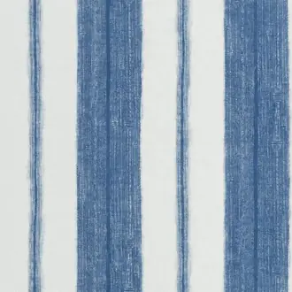
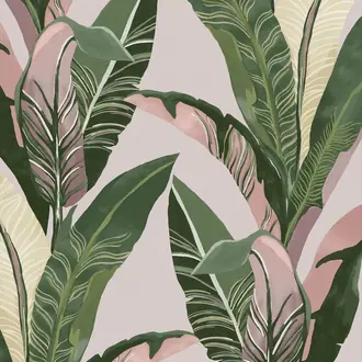
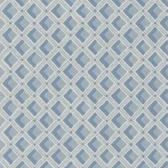
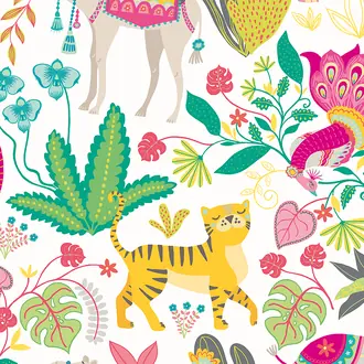

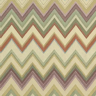
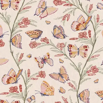

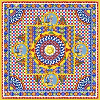
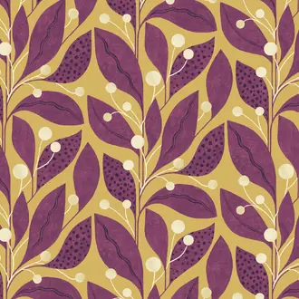

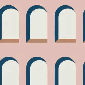
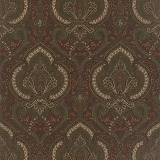
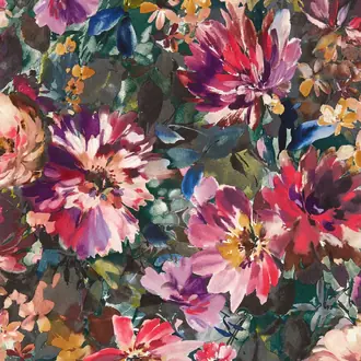
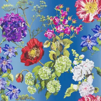

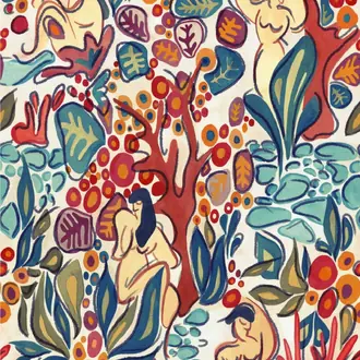
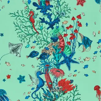
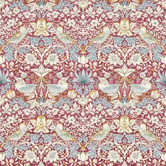
From quiet mineral lilac to saturated plum
Purple Wallpaper Defined by Undertone and Material
Purple spans several distinct decorating moods. Lilac and lavender can feel light and restrained, smoky mauve behaves almost like a neutral, and plum or aubergine creates a deeper, more enveloping room.
The finish matters as much as the shade. Printed papers preserve clarity, natural fibres introduce tonal movement, and metallic or patinated surfaces shift between violet, grey and bronze as the light changes.
Lilac and lavender
Pale, blue-leaning shades introduce colour gently and work particularly well with soft texture and restrained pattern.
Mauve and heather
Greyed purple tones are quieter and easier to combine with stone, warm neutrals, timber and muted upholstery.
Plum, violet and aubergine
Deeper or clearer shades provide greater contrast and suit bold pattern, murals and atmospheric complete-room schemes.

The lightest purple palette
Lilac, Lavender and Pale Purple Wallpaper
Pale purple can bring gentle colour to a room without becoming visually heavy. Lilac often carries pink warmth, while lavender and blue-violet shades feel cooler. Greyed versions are more subdued and may read almost neutral in indirect light.
Warm white, pale oak, linen and limestone keep the scheme soft. Charcoal or black details add definition, while muted green provides a natural complementary note.
Choose a fine texture or small repeat for several walls, and assess the sample throughout the day because these light shades respond noticeably to changes in daylight.

Colour organised by pattern
Patterned Purple Wallpaper
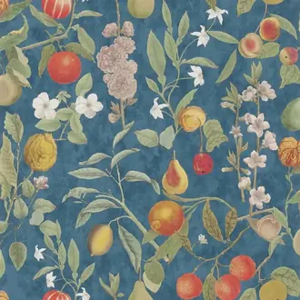
Geometric, floral and botanical designs allow purple to connect with a wider palette. Pink, blue, green, ochre and cream can all temper or intensify it, depending on which colours are repeated through the room.
Use the wallpaper itself as the palette guide. Select one quieter secondary shade for larger furnishings and reserve the strongest colour for smaller accents rather than trying to match every element.
Large motifs need clear wall area to read properly; smaller repeats are more adaptable around windows, doors, alcoves and fitted joinery.

A softer expression of colour
Natural and Textured Purple Wallcoverings
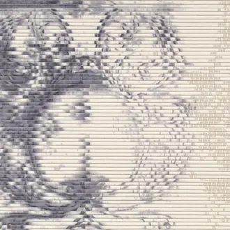
Grasscloth, paperweave and textile effects break purple into small changes of tone. This softens saturated shades and gives mauve, heather and mineral violet greater depth than a flat printed plain.
Natural materials work particularly well across complete rooms because the surface reads as part of the architecture. Tonal movement, visible joins and variation between lengths may form part of the intended character.
Combine muted purple texture with timber, plaster, linen, wool and stone for a grounded result that avoids feeling overly decorative.

Colour at an immersive scale
Purple Murals and Panoramic Wallpaper
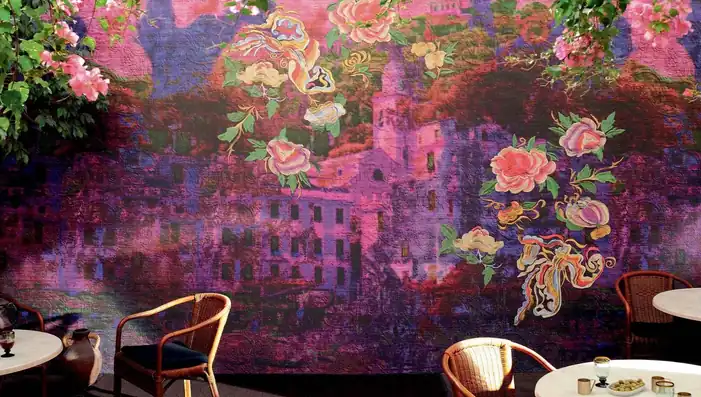
Murals let purple operate as atmosphere rather than a single block of colour. Landscapes, abstract compositions and oversized florals can move from pink and violet through burgundy, green and blue across one complete scene.
Plan the design around the architecture. Check where important details will fall beside windows, doors, fireplaces and furniture, and confirm which parts may be concealed after installation.
Repeat one of the mural's secondary colours elsewhere in the room to connect the panorama with upholstery, lighting or painted joinery.

The darker end of the spectrum
Plum, Aubergine and Deep Purple Wallpaper
Plum and aubergine contain more red and brown than clear violet, giving them a warmer and more enveloping character. They work well in dining rooms, bedrooms and snug living spaces where depth is part of the intended atmosphere.
Balance dark purple with warm white, oak, walnut, bronze, muted pink or ochre. Pale ceilings and deliberate lighting can retain definition without removing the colour's intimacy.
Embossed and structured surfaces deepen shadow further, so compare the relief as well as the face colour before choosing for several walls.

Colour that changes with the light
Metallic and Patinated Purple Wallpaper
Mica, metallic ink and aged-metal effects can shift purple towards silver, bronze or charcoal as the light moves. This makes a muted violet surface appear more complex without requiring an elaborate printed motif.
View reflective samples vertically and from several directions. Spotlights and direct daylight may emphasise patina, relief and differences between adjacent lengths more strongly than diffuse light.
Keep neighbouring finishes comparatively quiet where the wallpaper has a pronounced sheen, using matt paint, timber, stone and simple upholstery to balance the surface.
Building a considered scheme
Choose Undertone, Depth and Surface Together
Treat purple as a spectrum rather than one decorating colour. Its relationship to blue, red and grey determines how it behaves with the room's permanent materials and changing light.
Read the undertone
Blue-violet feels cooler; plum and aubergine are warmer; mauve and heather contain more grey. Compare samples directly with flooring and paint.
Match depth to the room
Pale lilac maintains openness. Deep purple creates intimacy. Patterned designs can combine several depths without covering the wall in one saturated tone.
Balance colour with material
Warm timber, stone, linen and bronze ground purple. Green provides natural contrast, while pink, red and blue build a more tonal scheme.

Samples and selection
See the True Undertone and Texture at Home
Purple is especially sensitive to surrounding colour and light. A design that appears violet online may look more blue, pink, brown or grey when placed beside the room's existing materials.
View samples vertically beside paint, flooring, fabrics and furniture at different times of day. For murals and large motifs, use the sample to judge colour and material, then refer to the full product image and technical information for composition and scale.
Continue browsing
Related Designer Wallpaper
Frequently asked questions
Purple Wallpaper FAQs
What colours work well with purple wallpaper?
Warm white, stone, grey and natural timber create a quiet foundation. Green provides complementary contrast, while pink, red and blue build a tonal scheme. Ochre, rust and antique brass add warmth to cooler violet shades.
What is the difference between lilac, mauve and plum?
Lilac is usually pale and may lean pink or blue. Mauve is generally greyer and more muted. Plum is deeper, warmer and contains more red or brown. Supplier naming varies, so use a physical sample to judge the actual undertone.
Can purple wallpaper be used throughout a room?
Yes. Pale lilac, muted mauve, fine textures and small repeats can work across several walls. Deep aubergine, vivid violet and large murals may be more suitable where an enveloping room or defined focal point is intended.
Does dark purple wallpaper make a room feel smaller?
Deep shades can make a room feel more enclosed, but this may create a desirable sense of intimacy. Pale ceilings, considered lighting and lighter furnishings preserve definition while retaining the depth of plum or aubergine walls.
Which rooms suit purple wallpaper?
Purple can work in bedrooms, living rooms, dining rooms, halls and home offices. Lilac and lavender feel calmer, mauve is versatile, and deeper plum or aubergine suits rooms where a richer atmosphere is welcome.
Why should I order a purple wallpaper sample?
Screens cannot reproduce undertone, texture or reflection precisely. Purple may move towards blue, pink, grey or brown as the light changes, so a sample should be assessed beside the room's permanent materials.
Do natural and metallic purple wallcoverings vary?
Natural fibres and handcrafted surfaces may show tonal movement and visible joins. Metallic and patinated finishes change with light and viewing angle. These characteristics are usually part of the material's intended appearance.
Do specialist purple wallcoverings require professional installation?
Many natural, metallic, textured and panelled wallcoverings benefit from an experienced installer. Follow the manufacturer's preparation, adhesive, roll-sequence and hanging instructions for the particular substrate.