



Pink Wallpaper
Explore pink wallpaper in shades ranging from soft blush, pale rose and dusty pink to coral, raspberry and stronger statement tones. Choose from plain and textured surfaces, florals, stripes, geometrics and decorative patterns from leading designer wallpaper brands.
Pink can shift noticeably with the light and colours around it, so consider the undertone as well as the pattern. Order samples where available to compare the shade in your own room, and check the individual product specification for roll or panel size, repeat, match and hanging guidance before ordering.

Get A Quote


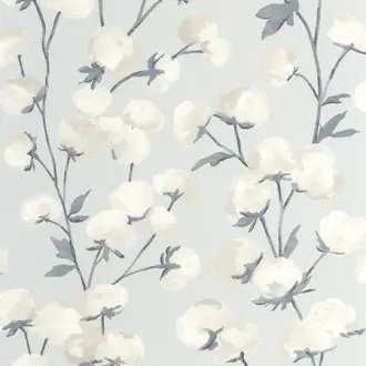

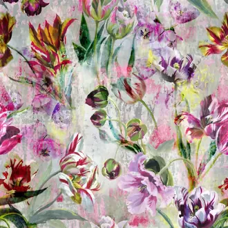
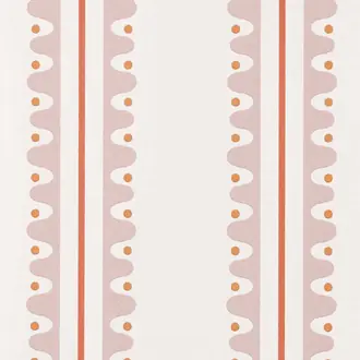
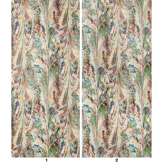

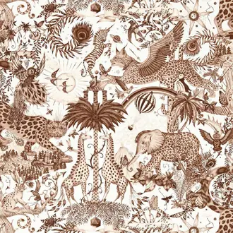
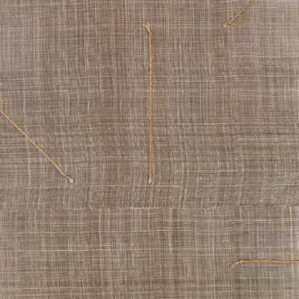
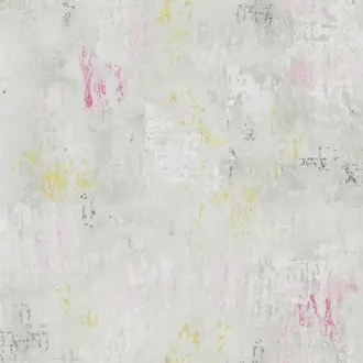
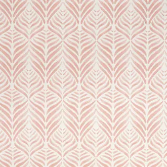
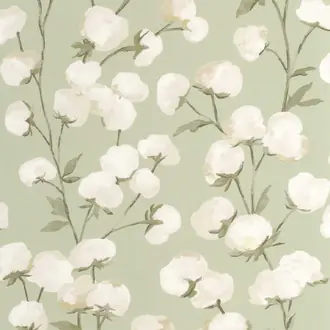

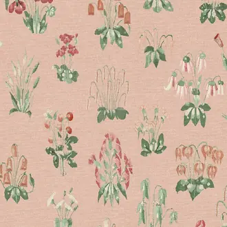

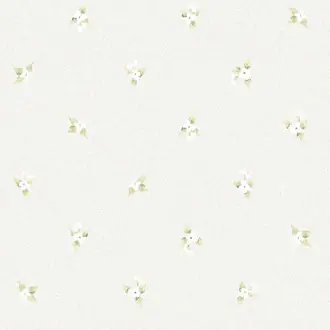

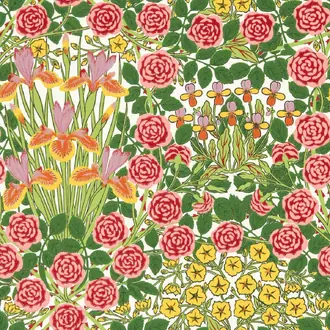
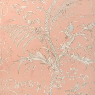




A colour family from quiet blush to vivid coral
Pink Wallpaper Beyond a Single Pastel
Pink wallpaper ranges from barely-there blush and pale rose to dusty, earthy tones and stronger coral, raspberry and fuchsia. Undertone determines whether the colour feels soft and neutral, warm and enveloping, or bright and energetic.
Pattern and surface change the effect again. A fine stripe gives pale pink structure, florals introduce complementary colour, and bold graphic repeats make saturated pink easier to balance across a complete wall.
Blush and pale rose
Soft pink can behave like a warm neutral, especially when muted with cream, beige, grey or natural texture.
Dusty and earthy pink
Grey, brown and terracotta undertones create a more grounded palette suited to timber, stone and bronze.
Coral and vivid pink
Stronger shades define the room and work well when balanced with crisp neutrals or contrasting green and blue.

Quiet colour and gentle structure
Blush, Pale and Light Pink Wallpaper
Pale pink is one of the easiest ways to introduce warmth without making colour the dominant feature. Blush, powder and soft rose sit comfortably with warm white, cream, pale timber and natural fibres.
A subtle stripe, small repeat or tonal texture gives a pale pink wall more structure while keeping the overall effect calm. These quieter shades can work across several walls rather than only as an accent.
Compare samples directly with paint and upholstery. A blush that appears neutral on screen may reveal peach, lilac or grey undertones beside other materials.

Decorative pattern and complementary colour
Pink Floral and Botanical Wallpaper
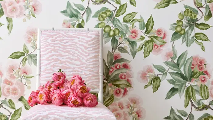
Pattern changes the way pink reads. Floral and botanical wallpaper introduces green, cream, blue and other secondary colours, allowing pink to become part of a broader decorative palette rather than the only statement.
Consider which colour will dominate once the repeat covers a full wall. A sample shows detail and surface, while the full room image and published repeat reveal the overall balance between pink, background and foliage.
Muted sage creates a softer result; deep green gives stronger contrast. Timber and natural upholstery help a decorative floral feel grounded rather than overly sweet.

Stronger colour and graphic energy
Bright, Coral and Fuchsia Pink Wallpaper
Coral, raspberry and fuchsia create a very different effect from blush or dusty pink. These saturated shades become a defining part of the room and suit spaces where colour and pattern are intended to be clearly visible.
Pattern can make bold pink easier to use. White, cream, orange, green or blue within the repeat breaks up the colour and provides ready-made options for furniture, paint and accessories.
Allow enough clear wall area for a large repeat to be read. Smaller geometrics and stripes adapt more readily around windows, shelving and fitted joinery.
Using pink beyond the bedroom
Balance Undertone, Pattern and Surrounding Materials
Pink can work in living rooms, dining spaces, hallways and home offices as well as bedrooms. The important decision is not the room type but whether the shade and pattern connect with its light, flooring and furniture.
Pink and green
Sage produces a soft botanical scheme, while forest and emerald green create richer contrast with blush, rose and coral.
Pink and blue
Blue cools a warm pink palette. Dusty blue is restrained; navy gives pale pink greater structure and definition.
Pink and neutrals
Cream, stone, timber and natural textiles make blush and dusty pink feel calmer; black introduces a sharper tailored edge.

Samples, undertones and specification
Check Pink in the Room's Actual Light
Pink is particularly sensitive to surrounding light and colour. North-facing rooms can make some shades appear cooler, while warm lamps may bring out peach, coral or terracotta undertones.
View samples vertically beside paint, flooring, curtains and upholstery in morning, afternoon and artificial light. Check the product specification for roll or panel dimensions, repeat, match, backing and hanging instructions before ordering.
Continue browsing
Related Designer Wallpaper
Frequently asked questions
Pink Wallpaper FAQs
What colours work well with pink wallpaper?
Cream and warm neutrals create a softer palette, green provides natural contrast, and blue cools warmer pinks. Dark timber, bronze and black can give pale or dusty pink a more tailored character.
What is the difference between blush, pale and dusty pink?
Blush and pale pink are normally lighter and softer, while dusty pink contains more grey, brown or muted undertones. Manufacturers use shade names differently, so compare physical samples.
Can pink wallpaper work in a living room?
Yes. Muted blush, dusty pink, botanical patterns and textured pink wallcoverings work particularly well with neutral upholstery, natural materials or darker furniture.
Is pink wallpaper suitable for bedrooms?
Yes. Softer pinks create a calm backdrop, while florals, geometrics and deeper shades produce a more decorative room. Consider the daylight and the colours of bedding, curtains and furniture.
Can pink wallpaper be used throughout a room?
Yes. Pale textures, stripes and small repeats can work across several walls. Bright colour and large-scale patterns create a stronger atmosphere and may be used throughout or as a focal treatment.
Why should I order a pink wallpaper sample?
Pink can change noticeably with daylight, artificial lighting and neighbouring colours. A sample lets you compare the true undertone, texture and scale with paint, fabrics, flooring and furniture.
Does every pink wallpaper use the same hanging method?
No. Pink describes the colour rather than the construction. Designs may use different substrates or specialist finishes, so follow the current adhesive and hanging instructions for the individual product.
Do specialist pink wallcoverings require professional installation?
Many natural, textured, metallic and panelled wallcoverings benefit from an experienced installer. Check wall preparation, roll sequence, adhesive and trimming requirements before work begins.