


White Wallpaper
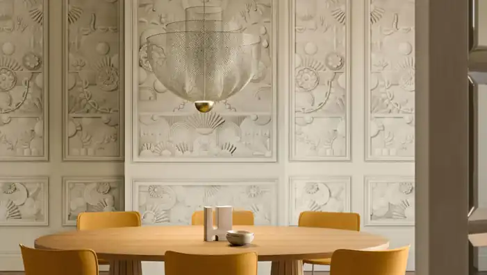
Explore designer white wallpaper from crisp white and chalk to ivory, pearl and warm off-white. The collection brings together woven textures, sculptural relief, tonal pattern, embroidery, monochrome prints and pale murals that use light and shadow to give white walls depth.
White is strongly influenced by undertone and surface. Cooler whites feel clean and architectural, while cream and ivory soften a room. Embossing, natural fibres and reflective detail prevent a pale scheme from appearing flat. Order samples to compare the true shade, texture and scale in your own light.

Get A Quote


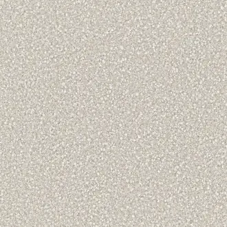
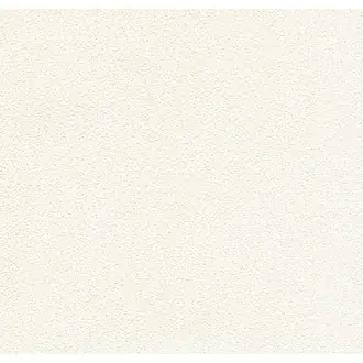



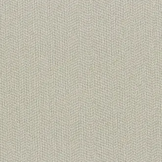
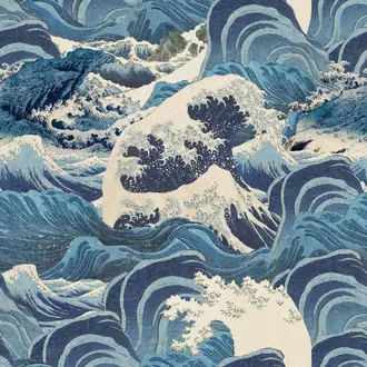
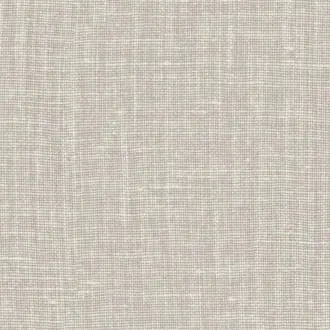
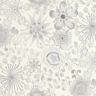


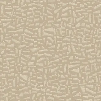



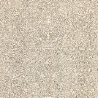


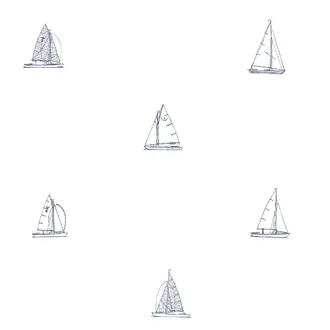
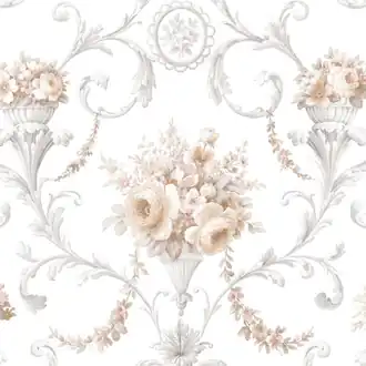

A pale palette defined by undertone and surface
White Wallpaper Beyond a Plain Background
White wallpaper can be crisp and architectural, soft and chalky, or warm with ivory and cream undertones. Its character comes from the way the surface holds light, shadow and pattern rather than from strong colour alone.
Woven fibres, embossing, embroidery, mica and tonal print create visible depth while keeping the room calm. White can therefore act as a quiet material finish or as the ground for a much more graphic design.
Crisp and cool white
Clean whites create clear contrast with black, blue-grey and contemporary architectural details.
Ivory and warm white
Cream, pearl and chalk undertones soften the palette and connect naturally with timber, stone and linen.
Tonal texture and relief
Embossing and woven surfaces use shadow to make white feel layered without introducing strong colour.

Soft undertones and gentle contrast
Warm White, Ivory and Cream Wallpaper
Warm white wallpaper contains subtle cream, beige, yellow or pink undertones. It feels softer than brilliant white and works especially well beside oak, walnut, limestone, linen and warmer upholstery.
Ivory and pearl designs can still feel light and contemporary when the pattern is restrained. Fine texture or a quiet repeat prevents larger wall areas from becoming visually blank.
Compare samples with ceilings, paint and permanent flooring. Two pale neutrals can look similar separately but reveal very different undertones when placed together.

Depth created by light and shadow
Natural and Textured White Wallcoverings
Grasscloth, sisal, paperweave and textile effects break white into small changes of tone. Relief creates shadow, while natural fibres may reveal flecks of cream, grey or beige that make the surface easier to coordinate.
Natural materials can show visible joins, panel variation and irregular fibres. These characteristics are generally part of the intended finish and should be assessed with a physical sample.
Textured white works well across complete rooms because it reads as a material rather than a printed statement. Timber, stone, linen, wool and black accents give it useful definition.

High contrast with a light ground
Black and White Patterned Wallpaper
Black and white wallpaper makes line, repeat and scale immediately visible. A white ground keeps the room bright, while black curves, stripes or geometrics provide enough structure for the wall to become a clear decorative feature.
Smaller repeats adapt easily around doors and windows. Oversized motifs need more clear wall area and create a stronger focal point, even where the overall palette remains neutral.
Repeat black sparingly through frames, lighting or furniture. Warm timber and cream textiles can soften a monochrome scheme without weakening its graphic character.

Pattern revealed through construction
White Floral, Botanical and Embroidered Wallpaper
White botanicals can be defined by tone, stitch, raised fibre or sheen rather than strong printed colour. The motif appears and recedes as light crosses the surface, creating a quieter alternative to a conventional floral.
A darker surrounding colour makes pale detail more prominent, while an all-white scheme produces a softer relief effect. Consider both the viewing distance and the direction of natural and artificial light.
Embroidered and specialist surfaces may require careful handling and professional installation. Check the manufacturer's hanging instructions before work begins.

Quiet imagery at architectural scale
White Murals and Panoramic Wallpaper
A pale mural can bring composition and movement to a wall without introducing dominant colour. Fine lines, mineral washes, abstract forms and tonal landscapes use subtle contrast to create an immersive but calm backdrop.
Plan the image around doors, windows, fireplaces and furniture. Pale murals can contain very delicate detail, so check that the principal features remain visible once the room is furnished.
Warm upholstery and timber reinforce ivory undertones; black details create a sharper contemporary edge. Directional lighting can reveal metallic lines or raised areas that are less obvious in flat daylight.
Choosing a pale wallcovering well
Judge Undertone, Texture and Light Together
White changes more than expected between rooms. The surrounding materials, direction of daylight and type of artificial light can make the same design appear cool, creamy, grey or softly pink.
Compare nearby whites
Place the sample beside ceilings, skirting, paint and stone. A brilliant white trim can make an ivory wallpaper appear much warmer.
Use shadow deliberately
Embossing and weave become more visible under side lighting. Flat frontal light produces a quieter, more uniform surface.
Introduce enough definition
Timber, black, metal or deeper upholstery helps a pale room retain structure without losing its light, calm character.

Samples and selection
See the Undertone and Texture at Home
Screens cannot show whether a white is cool, creamy, chalky or pearl, and they flatten woven fibres, embossing and reflective detail. These differences become especially visible beside other pale materials.
View samples vertically beside paint, flooring, stone and fabrics in morning, afternoon and artificial light. For murals and large motifs, use the sample to assess colour and surface, then refer to the full image for composition and scale.
Continue browsing
Related Designer Wallpaper
Frequently asked questions
White Wallpaper FAQs
Is white wallpaper warm or cool?
Either. Crisp and blue-based whites feel cooler, while ivory, cream, chalk and pearl are warmer. The apparent undertone also changes beside flooring, paint and furniture, so a physical sample is important.
Why use white wallpaper instead of white paint?
Wallpaper can add weave, relief, sheen and tonal pattern while retaining a pale palette. These surface qualities create depth and movement that a flat painted finish does not provide.
Can white wallpaper work throughout a room?
Yes. Textured plains, small repeats and subtle tonal designs are well suited to several walls. Graphic black-and-white patterns and large murals create a stronger feature and may need more visual space.
What colours work with white wallpaper?
Almost any colour can work, but the white's undertone matters. Warm white suits timber, brown, rust and olive; cooler white works well with black, grey and blue. Use colours already present in a patterned design as a reliable guide.
Does textured white wallpaper show dirt easily?
Suitability depends on the material and room. Check the manufacturer's cleaning and durability information. Delicate natural fibres may be less suitable for high-contact areas than washable vinyl or performance wallcoverings.
Why should I order a white wallpaper sample?
Subtle undertones and textures are difficult to reproduce on screen. A sample shows whether the white leans cool, cream, grey or pink and reveals the real scale, surface and reflectivity.
Do natural white wallcoverings vary between lengths?
Natural fibres and handcrafted surfaces may show tonal movement, visible joins and panel variation. These characteristics are generally part of the material's intended appearance rather than faults.
Do specialist white wallcoverings require professional installation?
Many natural, embroidered, metallic and deeply textured wallcoverings benefit from an experienced installer. Follow the manufacturer's preparation, adhesive, roll-sequence and hanging instructions.