


Yellow Wallpaper
Explore designer yellow wallpaper from soft butter, primrose and straw to clear lemon, mustard, ochre and golden tones. The collection includes floral and botanical patterns, crisp geometrics, murals, natural textures and tactile embossed wallcoverings for both understated and expressive interiors.
Yellow changes noticeably with light and surrounding colour. Pale shades can gently warm a room, while mustard and ochre introduce greater depth. Samples are available across many designs so you can compare the true shade, pattern scale and surface in your own interior.


Get A Quote











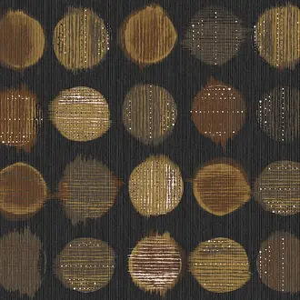
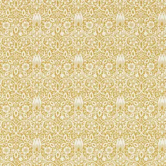
From soft butter to confident ochre
Yellow Wallpaper Shaped by Shade and Light
Yellow is a broad family rather than one fixed colour. Pale butter and primrose can behave like warm neutrals, clear lemon creates a fresher contrast, and mustard, saffron or ochre bring an earthier depth.
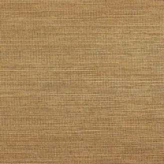
The surface matters too. Matt printed papers show colour clearly, while grasscloth, embossing, metallic detail and textile effects divide yellow into highlights and shadows. That variation can make a stronger shade easier to live with across a larger area.
Butter and primrose
Soft, light-reflecting yellows introduce warmth without dominating a calm interior.
Lemon and clear yellow
Cleaner tones feel lively and contemporary, especially beside white, blue or charcoal.
Mustard and ochre
Deeper, earthier shades connect naturally with timber, brown, olive and warm neutrals.

A gentler way to warm the room
Pale Yellow, Butter and Primrose Wallpaper
Pale yellow can bring warmth while retaining much of the openness associated with cream and off-white. Butter, primrose and washed straw tones are particularly useful in rooms that need colour without a strong visual boundary.
Pair them with warm white, pale timber, soft green or muted blue. Natural linen and chalky paint prevent the scheme from becoming overly sweet, while a small-scale pattern adds quiet movement.
In cool northern light, test for green or grey undertones. In warm afternoon light, the same paper may appear richer and more golden.

Earthier yellow with greater depth
Mustard, Ochre and Golden Yellow Wallpaper
Mustard, ochre and saffron contain more brown or orange than a clear primary yellow. The result is warmer, more grounded and often comfortable across a complete room.
Walnut, oak, tan leather and aged brass reinforce their warmth. Charcoal and deep blue introduce definition, while olive and rust create a layered palette with a natural, collected quality.
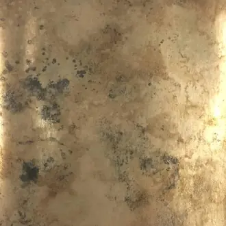
Some golden wallcoverings contain metallic ink, foil or lustrous fibre. Check a sample in both daylight and artificial light to understand how reflective the finish will be.

Colour carried through natural pattern
Yellow Floral and Botanical Wallpaper
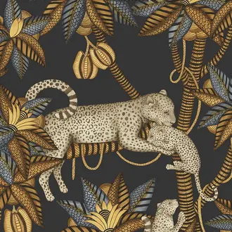
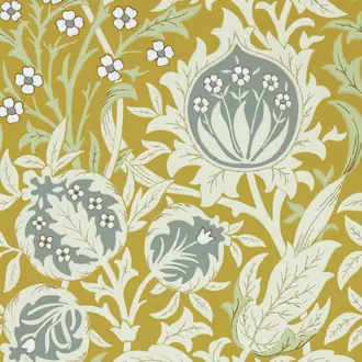
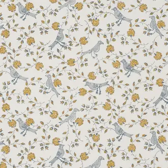
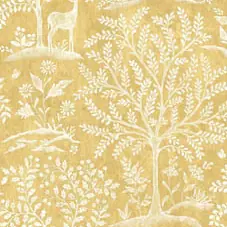
Floral and botanical patterns distribute yellow through petals, foliage, birds and decorative grounds. They can feel softer than an uninterrupted yellow wall because the surrounding colours break up the surface.
Blue and green details create a fresh garden-led palette; ochre, coral and brown produce a warmer, more traditional effect. Pull one quieter colour from the design into curtains, upholstery or painted joinery.
Large botanicals and scenic florals need enough clear wall to read properly. Smaller repeats adapt more easily around windows, doors and fitted furniture.

A clearer, more graphic expression
Yellow Geometric, Striped and Abstract Wallpaper
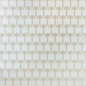
Geometric and abstract patterns give yellow a more architectural character. Fine lines and small repeats add controlled energy, while large shapes make the wall a stronger part of the room's composition.
Yellow with white feels crisp; yellow with grey or black is more graphic; blue creates a confident complementary contrast. Tonal mustard geometrics offer a quieter alternative where the pattern should be noticed gradually.
Check the repeat and wall dimensions before ordering. The scale shown in a room image may feel very different when viewed on a smaller sample.

Colour with tactile surface
Textured and Natural Yellow Wallcoverings
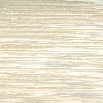
Embossed papers, grasscloth, raffia, paperweave and textile wallcoverings allow light to move across yellow rather than presenting it as a completely flat field. The result can range from subtle straw texture to a highly sculptural statement.
Natural fibres may include tonal movement, visible joins and variation between lengths. These characteristics are normally part of the intended material rather than faults.
Use texture where the material itself should contribute to the scheme. Simpler furniture and good directional lighting allow the surface to remain visible.
Building a balanced yellow scheme
Choose Intensity, Undertone and Surface Together
Decide first whether yellow should behave as a light-reflecting background, an earthy enveloping colour or a crisp accent. The correct undertone and material will then be easier to identify.
Check the undertone
Green-yellow feels sharper, orange-yellow is warmer and brown-yellow becomes mustard or ochre. Compare samples directly with the room's permanent finishes.
Balance the intensity
White and pale timber keep yellow fresh. Grey and charcoal provide definition. Blue and green create stronger colour relationships without relying on more yellow.
Consider the whole wall
A small vivid sample can feel much stronger over several metres. Pattern, texture and broken colour often make yellow easier to use at scale.

Samples and selection
See Yellow in Your Own Light
Yellow is especially sensitive to daylight direction, artificial lighting and neighbouring colours. A design that appears fresh online may look warmer, greener or more muted once placed beside flooring, paint and furniture.
View samples vertically during the morning, afternoon and evening. For natural, metallic and embossed wallcoverings, move the sample around the room to see how the surface responds to light.
Continue browsing
Related Designer Wallpaper
Frequently asked questions
Yellow Wallpaper FAQs
What colours work well with yellow wallpaper?
White and cream keep yellow light, while grey and charcoal add definition. Blue is a strong complementary partner, green creates a natural scheme, and brown or timber works particularly well with mustard and ochre.
Is yellow wallpaper suitable for a complete room?
Yes. Pale yellow, muted mustard, ochre, small repeats and textured wallcoverings can work comfortably across several walls. Very bright yellow or a large high-contrast pattern may be better where a more energetic or focused result is intended.
What is the difference between mustard, ochre and yellow wallpaper?
Mustard is a deeper yellow with brown or muted green undertones. Ochre is earthier and often leans towards orange or brown. Clear yellow contains less brown and normally appears brighter and fresher.
Does yellow wallpaper make a dark room brighter?
It can make a room feel warmer and more cheerful, but wallpaper cannot replace adequate lighting. Pale yellow with a lighter ground reflects more light than deep ochre, while reflective or lustrous surfaces respond strongly to artificial light.
Can yellow wallpaper work in a bedroom?
Yes. Soft butter, straw, muted floral and ochre designs are generally calmer than vivid lemon. Pair them with natural textiles, warm white, pale blue or timber for a more restful result.
Is gold wallpaper included with yellow wallpaper?
Some designs described as gold visually belong to the yellow family, particularly warm ochre and non-reflective golden tones. Metallic gold wallcoverings may also appear within the metallic collections, depending on their material and finish.
Why should I order a yellow wallpaper sample?
Yellow changes considerably with room orientation and artificial lighting. A physical sample also shows the true pattern scale, texture and whether any gold or metallic areas are reflective.
Do textured yellow wallcoverings require professional installation?
Natural fibres, metallics, embossed surfaces, wide-width products and murals often benefit from an experienced installer. Always follow the manufacturer's wall preparation, adhesive and hanging instructions for the individual product.