My Basket
Sample
Loading...
Our interior design team have picked paints to perfectly pair up with a selection of soem of our favourite wallpapers from thsi year's spring/summer collections.
A new year and a new season are always a time of joy and what better way to embrace the onset of spring than with a review of some of the spring 2022 wallpaper collections. We asked our interior design team to pick some of their favourite wallpapers from their new collections and recommend some paints for a perfect pairing.
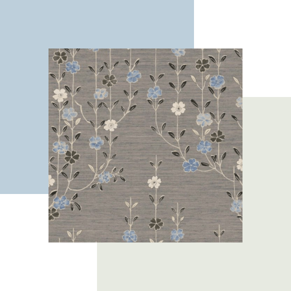
The Spring/Summer collections from Designers Guild are as impressive as you would expect with a wonderful mixture of botanical, plain and patterned papers and fabrics. The first of their new wallpapers which caught the eye of our design team is the stunning Jardin Botanique in Birch with its dramatically large-scale painterly flowers. The delicate colours in the bloom of flowers provides a rich choice of colours which can be used to complement the Jardin Botanique wallpaper, the painterly design also affords some forgiveness in choosing shades which are stonger or lighter without being an exact match.
For the perfect pairing our team have chosen Little Greene's Gauze Dark (No 166) Paint, a delicate blue grey which pairs perfectly with the base colour of the Jardin Botanique wallpaper, bringing out the blue notes. The Guaze Dark paint is very slightly darker than the base colour in the wallpaper but this should ensure your eye is naturally drawn to the wallpaper making it perfect for a feature wall. This grey paint from Little Greene would also work well on any woodwork and as an accent colour throughout the room. it would work as both on an adjoining wall as well as an accent colour in the room.
The second perfect pairing is Zoffany's Powder Puff Paint, this paint offers a delicate blush of baby pink and you can instantly see how using it completely changes the balance of the Jardin Botanique wallpaper giving a much more delicate feel, perfect for a bedroom. Blush pink is also a great way to lift and contrast greys, making it perfect for a interior which combines both the grey and blush paint colours to really enhance the wallpaper.
Another wonderful wallpaper in Designers Guilds' Spring Summer 2022 collection is Porcelaine de Chine in Noir. This wallpaper is part of the dazzling collection of wallpapers with the same name, each design taking inspiration from 18th century porcelain designs. The Porcelaine de Chine in Noir wallpaper is a trailing design full of beautiful blooms in vibrant colours interspersed with exotic birds and beatufully colourful butterflies evoke the magic of fine porcelain.
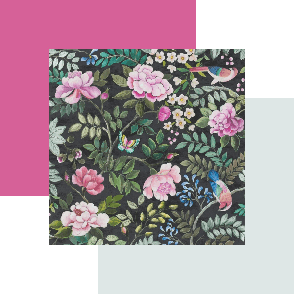
Designers guild have already suggested a perfect pairing for their Porcelain de Chine wallpaper in the form of their Steel (No 34) paint, the soft pale grey paint with hints of blue complements the foliage highlighting the silvery blues. The wallpaper design is full of other fabulous colours meaning it would pair well with greens, creams, off-whites and pinks. With such a wide choice of fresh bright colours our team thought it would be shame not to play to them and opted to pair it with the wonderfully bright pink of Designers Guild Lotus Pink (No 127) paint. The wonderful Porcelain de Chine wallpaper is available in eight colourways, with four of the colourways also offering a matching fabric.
Boråstapeter's Saphire Birds is a design which could also equally be transposed onto a porcelain design. Part of Boråstapeter's Treasured Collection, this wallpaper is full of graceful birds pictured amongst rich foliage. The base colour is a dark sapphire blue, and whilst you could pair a matching blue paint with the wallpaper there is a risk it may draw the walls in which may not be suitable for every space. To lift the paper and draw it out into thr room our interior design team recommended picking up on the green of the foliage with a deep orange or copper as an accent colour, either of which will reflect and draw out the birds in the design.
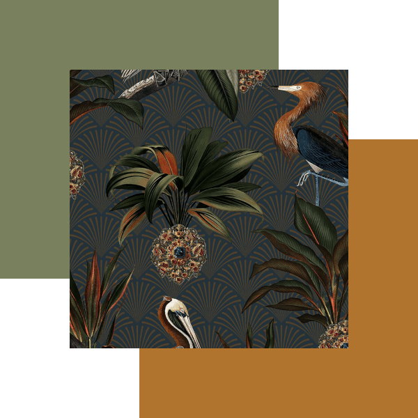
Sage Green (No 80) Paint from Little Greene tones in with the lighter shades of green in the Saphire Birds wallpaper, the darker tones will ensure the wallpaper is the center of attention but it you want to open out the room further you could choose a lighter green.
There are a few options for an orange paint to compliment the foliage gives a few options Little Greene's Heat No 24 offers a darker orange, but if you intend to use the green and orange with the paper our team recommends Middle Buff (No 122) Paint, also from Little Greene, this orange paint with its mustard yellow hues was popular in the 1930s and has a mid-century modern feel about it. It has the benefit of reflecting and complimenting the birds and the foliage as well as highlighting the fan detail behind. An orange like this would work equally well on curtains, cushions or even as a velvet for upholstery, but if you are still not convinced you could achive the same effect through the subtle use of copper tones in lamps or light fixings.
Lewis and Wood's latest wallpapers include the Japanese Kimono inspired Blossom, this beautiful and subtle floral paper is part of their Wax Works wallpaper collection and is available in seven fabulous colourways including the pink and greens of Peony Jade, the ochre's and blues of Blue Ginger, and the pinks and greys of Powder Cloud. However, for our perfect pairing collection the team picked Aerial, https://www.lewisandwood.co.uk/wallpapers/blossom/ https://tm-interiors.co.uk/lewis-and-wood-blossom-wallpaper-aerial-lw-326-322 .
In this Aerial Blossom wallpaper your eye is instinctively drawn to the different shades of blue in the flowers, this could be maximised by the use of both dark and light blue paints. As a paint our team picked out Sanderson's Window Blue (No 162) paint, this delicate almost duck egg blue can be used with confidence without detracting from the Blossom wallpaper. This paper could also be paired with an off-white, espectially one with pink or yellow tones. However, for a fresh look our team paired the Aerial Blossom wallpaper with the delicate greens of Pearl Colour Pale (No 167) Paint from Little Greene.
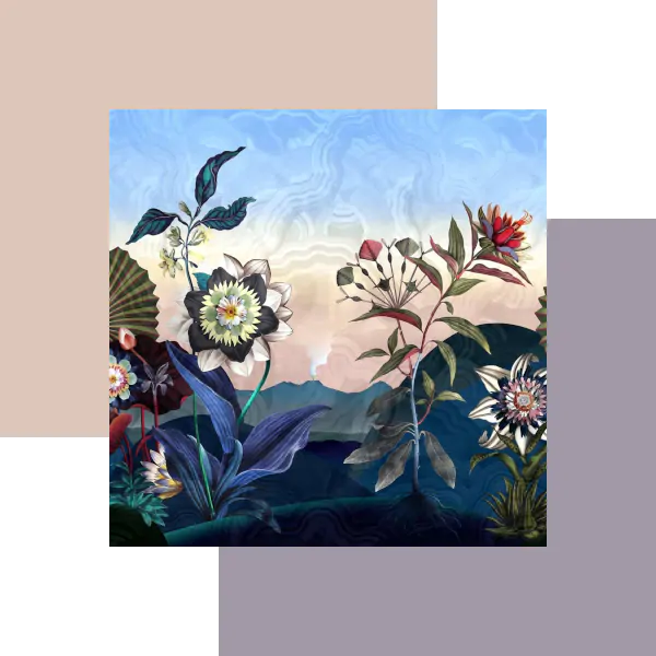
Christian Lacroix wallpapers are always visually stunning but this year's spring/summer collection, Utopia, are truly extravagent works of art, making htem perfect for feature walls. The Atlantis wallpaper, shown above, , like the other designs in the Utopia collection, is full of uplifting colours making it open to pairing with a very wide variety of colours but our team considered a bare plaster or off-white would set it out as a feature wall. In the selection below our team has paired the Atlantis paper with Dorchester Pink (No 213) Paint from Little Greene, this colour perfectly encapsulates the pinks and yellows of the sunset making it a superb choice for adjoining walls. For an accent colour, or as an alternate choice, our team found a perfect pairing in Zoffany's Grey Violet Paint, this wonderful dusky violet tones in perfectly and can be used to frame and reflect the Atlantis wallpaper.

We hope the above has provided you with some inspiration for matching the latest paints and papers but if not there are hundreds more wallpapers to discover in the latest Spring/Summer 2022 collections all of which can be found on our new collections page. If you find the perfect wallpaper on our website and would like some help choosing matching fabrics and paints send us an email or call our friendly customer service team. We also offer colour consultancy and interior design services.

